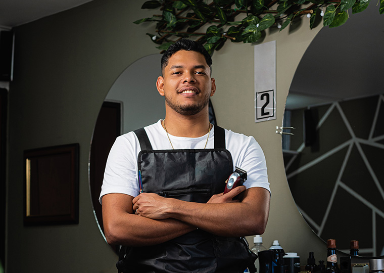
Founded by brothers Alan and Reece Beak, RUGER provides a minimalist, Scandi-inspired interior where, along with their team, they can put their training in traditional Italian barbering, ladies’ hairdressing and Afro-Caribbean style to good use.
When did the barbershop open?
We finally opened the barbershop in October 2022.
When you acquired the property, what was it being used for?
It was empty and falling into ruin; previously it was being used for a mixture of commercial and residential purposes. The bottom floor was offices and a garage, and the middle and top floors had been turned into living areas.
What was your budget?
The budget for the entire renovation was £250,000. As we all know budgets are never kept to, and due to the rise in costs of labour and materials we have since doubled this figure.

Is the barbershop meant to appeal to anyone in particular?
The simple answer is everyone. We wanted to create an environment so that people from every walk of life would be comfortable here.
Does the barbershop look different in separate areas, and if so, why?
Yes, we wanted to create two areas – an east wing and west wing. One side has a more industrial and unrefined look and the other is more clinical and refined. We like to call it reforesting the balance of life or order vs chaos.
What makes the space unique?
The way we stand out is through the people we got involved to help create it. Everything you see in the barbershop has either been made bespoke for us or sourced from designers that you wouldn’t normally associate with the hair industry – making it hard for anyone to replicate or find easily. This is how we’ve managed to make it completely unique.
What influenced the design?
The design was influenced by the Scandi movement of interior design, combining minimalism with raw materials.
What is the colour scheme and why did you pick it?
The colour scheme was very basic but with a big impact. The tones we went for are all quite neutral and earthy. The walls are in pebble – light enough to give good light refraction and the illusion of ample space. The recesses are dimly lit and are in ‘mud’, to create a warmer and cosier feel; one example of this is our backwash.
Tell us bit about the designers, and where you bought the furniture and any artwork?
The design company called YOUTH STUDIO gave us a very detailed and precise plan of things like the workstations, shelving, lighting plan and seating. One of the directors involved was called Liam McGroarty, and he’s been amazing in helping us bring the design to life.
How many chairs are there?
In total there are eight chairs and stations, with the space to put another inside the barbershop when the work has finally been completed and we can continue to expand.
Describe the lighting in each area, why it was chosen, and what effect does it have?
We wanted to have different tones of warm light and daylight white light. For this reason, we used different types of lighting, such as spotlights and LED panels that are at head height and eye level to laminate the clients and make the work much easier.
What are the walls covered in and why?
Away from the coloured walls and in keeping with the specs from the designer, we used different wall covers like stainless steel – this gives the shop a very clinical and futuristic feel. We also have a very specific plaster which we bought from Denmark from a company called St. Leo. The plaster is made using stones from the Dolomites and gives a very natural and rustic touch to the walls.
What is the floor made from and why?
The east wing is the unrefined section of the barbershop, so for this side we opted for a polished concrete flooring; we achieved this by using two different coloured screed compounds and then covered it with epoxy resin. The west wing floor is covered with terrazzo tiles, as specified by Liam, our designer.
Do you have any regrets or things you would do differently?
I don’t have any regrets when taking on the building, it has been a labour of love and the hard work and determination that has gone into the project has made me so proud. There has been lots of blood, sweat and tears, but the investment will last a lifetime. It’s good to do the hard work now and reap the benefits later in life. The mistakes that have been made in the process only serve as valuable life lessons. It’s been an incredible journey – not one I’m rushing to go through again – but hopefully in years to come it will all be worthwhile.


